AmpliFI Rewards
How might we create a modular, white-labeled rewards platform for thousands of small-midsized banks?

Design Task
The primary objective was to design and develop a modern, responsive, and accessible user experience within a ~6-month timeline. The existing website was outdated and failed to meet accessibility standards. The new design needed to be modular and white-labeled, catering to both business and user needs.
Scope & Timeline
The project followed an agile approach, spanning 10 two-week sprints with a hard deadline of November 2020.
Phase 1: Research & Analysis
Conducted user research and stakeholder interviews to identify pain points.
Mapped user journeys to understand existing workflows and improve navigation.
Performed a landscape analysis to benchmark industry standards and best practices.
Phase 2: Design & Implementation
Designed an intuitive and modern interface while ensuring compliance with accessibility guidelines.
Developed a modular system that allowed for easy customization and scalability.
Integrated the new front-end experience with existing backend technologies for seamless functionality.
Conducted user testing and iterative refinements to enhance usability.
Results & Impact
Successfully launched the new experience within the given timeframe.
Improved accessibility, ensuring compliance with WCAG guidelines.
Enhanced usability and engagement through a more intuitive and modern interface.
Created a scalable, white-labeled design that met both business and user needs.
This project demonstrated the effectiveness of cross-functional collaboration and agile development in delivering a high-quality, user-centric digital experience within a tight deadline.

User Interviews
Prior to 2020, user interviews were conducted in person at individuals' workplaces. However, due to the shift in circumstances in early 2020, the process transitioned entirely to a remote format.
To adapt, we recorded every user interview and transcribed our findings using virtual post-it notes. Our primary interviewees included employees from ampliFI and customer service representatives, as they interact most directly with front-end users. The goal was to identify pain points and areas for improvement in the user experience.
After gathering insights, we synthesized our findings into categories and formulated "How Might We" statements. This process allowed us to structure our insights into actionable opportunities. Based on these, we developed a timeline of features and capabilities for the project as a whole.
User Journeys
Through our research, we discovered significant differences between internal and external processes. To address this, we created two distinct journey maps:
Internal User Journey: A flowchart mapping out how internal processes interconnect, providing a structured overview of operational workflows.
External User Journey (Cardholders): This journey categorizes users by different use cases. For instance, "Gaby Gift Cards" represents a persona primarily interested in redeeming points for gift cards.
Using insights from the interviews, we identified key pain points within each journey and mapped them accordingly. This helped us visualize challenges and opportunities, ensuring that our design and development efforts aligned with user needs.

Landscape Analysis
We explored various websites and apps to understand best practices, spot trends, and identify areas for improvement. User interviews helped us ensure a user-driven approach.
Key Takeaways:
Industry trends and best practices shaped our direction.
Competitor strengths and weaknesses highlighted opportunities.
We identified ways to make our product stand out and fill functionality gaps.
Sitemaps & Wireframes
Our initial wireframes mapped out our product’s structure and improvements. They helped refine user flows for a smoother experience.
Key Takeaways:
Clear, simple navigation for better usability.
Logical content structure for user-friendly access.
Optimized user flows for efficiency.
Aligned design, development, and stakeholder vision.
These insights will guide us as we refine our wireframes and build a user-centered product!

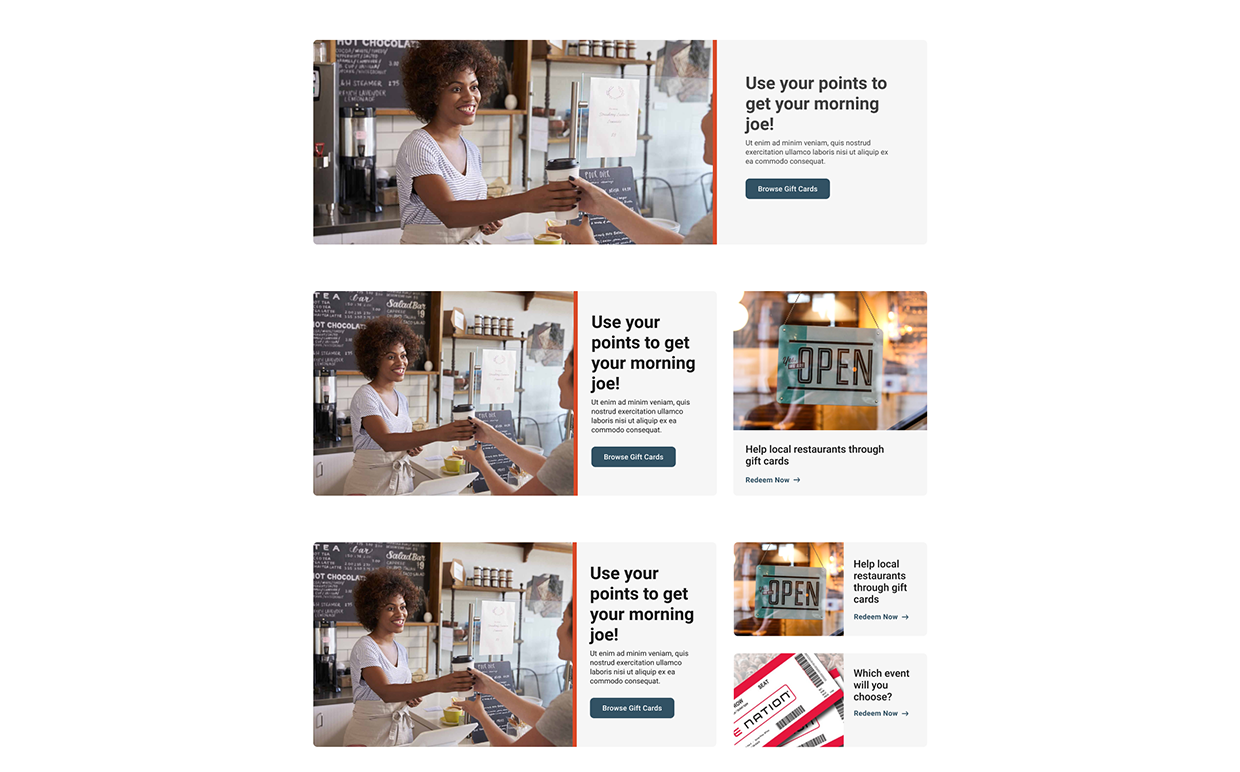
Component Library
Our component library was at the heart of this project. Since it was a white-labeled product, we made sure everything was easily customizable—from logos in the header to colors across the page—so each bank could make it their own.
Beyond basic building blocks, we created modular, responsive components that met both user and business needs. One standout was a versatile card element, perfect for banks to promote events and products in a flexible 1-3 card layout.
To keep things smooth, we included interaction notes for developers and worked closely with them throughout the process. Their input helped ensure our designs weren’t just beautiful—they were practical and easy to build.
Iconography
For this project, we created a set of custom icons designed to make navigation simple and intuitive. But these weren’t just any icons—they were smart! They automatically adjusted their colors to match each bank’s brand while making sure everything stayed accessible for all users.
To get them just right, we ran some tests to find the best designs. Then, we built a system that checked the bank’s primary and secondary colors against accessibility standards. If a color didn’t meet AA contrast requirements on our white background, the icons switched to a neutral color to keep everything clear and easy to read.
The result? A set of icons that looked great, stayed true to each brand, and worked for everyone—no compromises needed.
Design
The design was minimal and structured, with a strong focus on componentization, which was a new experience for the team. Every element on the website was turned into reusable components, allowing for flexibility and customization. Individual bank branding was incorporated into UI details, and the navigation system had backend toggles to accommodate different offerings for over 2,000 banks. This customization was essential, as each bank had varying needs in terms of navigation, advertisements, and featured offerings.
By November 2020, most planned features were successfully implemented. The site functioned as both a marketing and eCommerce platform, offering banking profiles and reward shopping. Despite navigating significant challenges and red tape, the team effectively managed complexities and created a scalable solution. The structured approach made the project both enjoyable and a model for future work.

